Date
October 27, 2023
Category
IllustrationAbout This Project
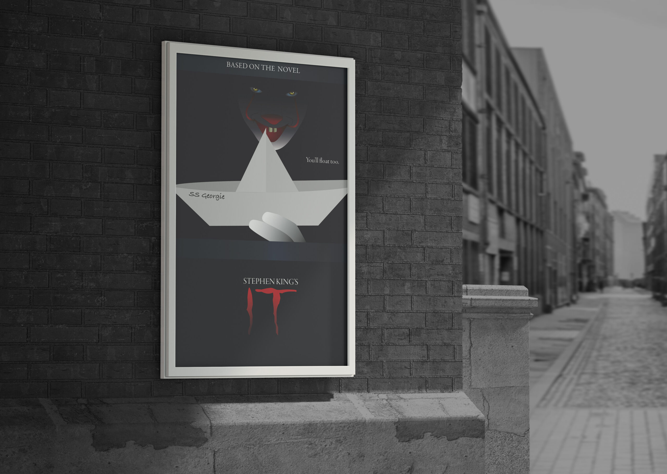
Movie Poster Project
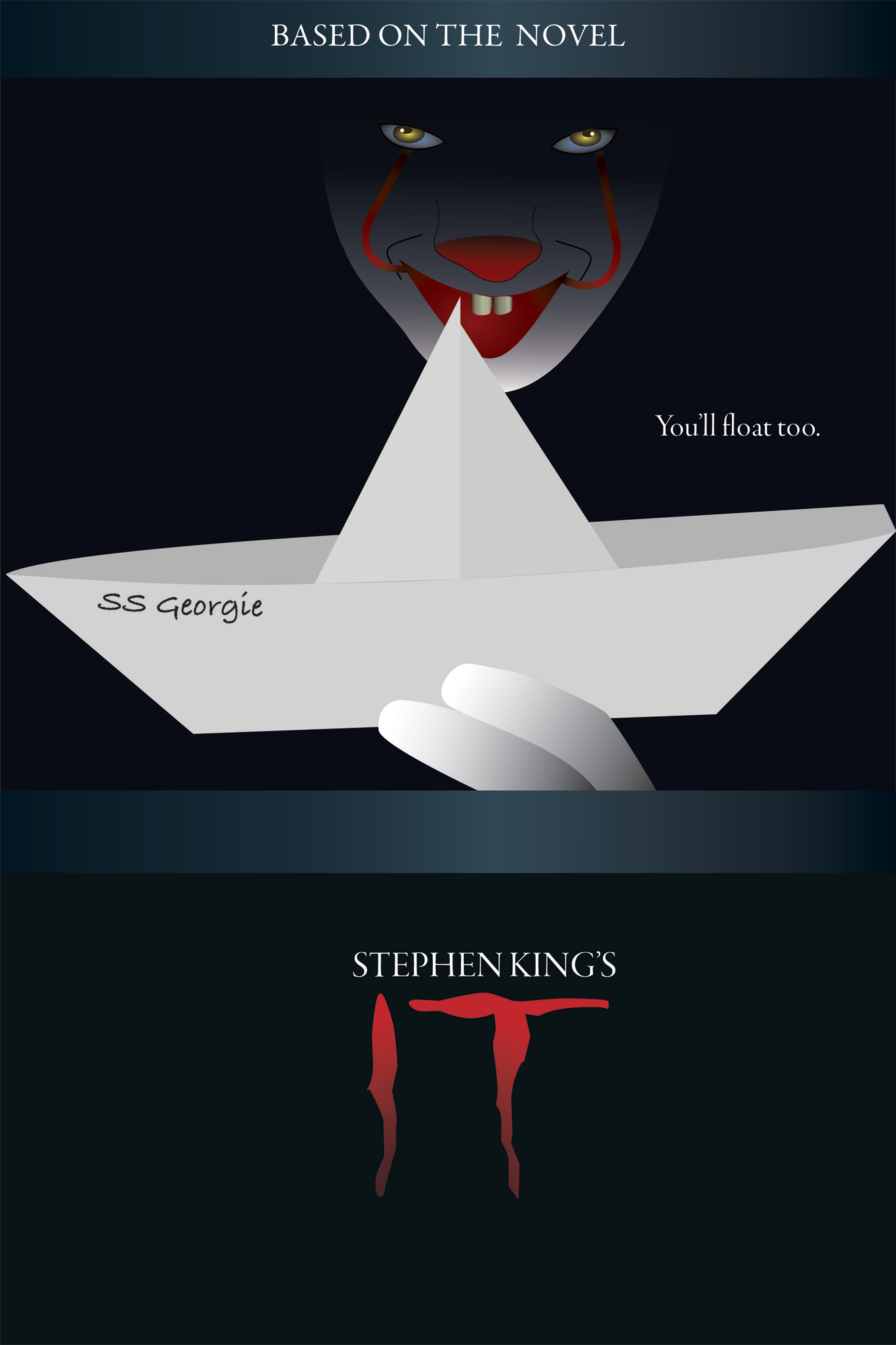
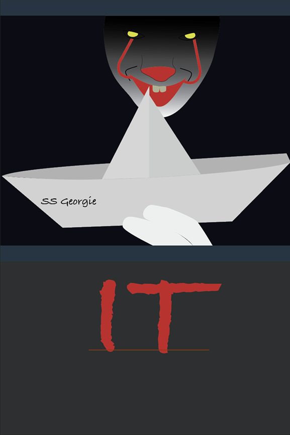
I was tasked to design any movie poster I desired with the only criteria being it had to be all illustrations. Since it was nearing Halloween I wanted to do a horror film and decided to redesign the cover of my favorite horror film ‘It’.
Getting Started
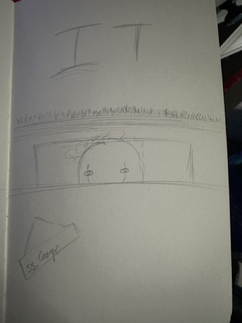
Before even touching Illustrator I did some research. I searched up the already created movie posters for the film and I rewatched the film to pinpoint some key moments. Then I sketched up a few of the key moments for a general idea of what I could do. I finally decided on the scene of him in the storm drain because it’s one of the most iconic scenes.
Illustrator Time
Finally it was time to open Illustrator, I started by uploading my sketch to trace it and then gave it some color. I had to be careful with the shades of white I was using because his face was white but the paper boat I wanted to do was more off white. So, for each piece of the boat I had to make it darker to add a sense of depth.
Gradients Gradients Gradients
For the gradients I had to focus on each piece of the design. The storm drain was designed to look metallic. Since the character, Pennywise, was in the storm drain I needed to take into account some shading. I started with his fingers, using a linear gradient which also made them more round. I then did a similar gradient to his face making the top of his head the most into the darkness, mainly where his eyes were because I wanted them to pop like they did in the movie.
For the eye I did a radial gradient for both the eye whites and the pupils. The eye whites had more of a blue hue and the pupils I had were a bright yellow in the center. I did more simple linear gradients with the red to blacks on his nose, mouth and face. For his teeth I used several colors to really make them look round and really look like teeth.
Text
For the text, on the boat I searched for a more handwritten font. The title needed something eerie and had a Stephen King feel. For the other text I looked for a serif that complimented the movie poster as a whole.